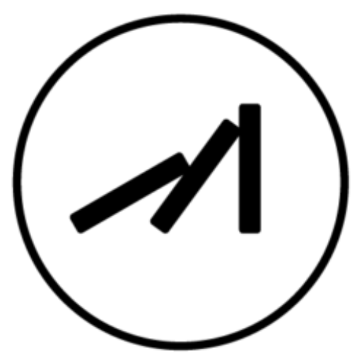

業主的需求是希望一支羽毛筆的形象,我們在搜尋資料的過程中,發現相關的事務所有蠻多品牌都是以筆或跟羽毛有關,也不建議品牌的形象太過複雜,所以我們將羽毛的形象做了一些延伸讓他有點像展翅高飛的翅膀,象徵希望與翱翔也代表潤宇聯合地政士事務所的真誠與效率,因代書性質,以鋼筆的形象為準,整體還是有保留羽毛跟筆的結合。品牌標識均為幾何物件組合而成,配色上為藍色,代表公司既現代又穩重,提供專業的服務,不僅是值得信賴的好品牌,也是帶你放遠世界的好公司。
The client’s requirement was to incorporate the image of a fountain pen. During our research, we found that many brands in the industry use pen-related or feather-related imagery. It was advised to keep the brand image relatively simple. Therefore, we extended the concept of a feather to resemble wings spreading and soaring, symbolizing aspirations, excellence, and the genuine and efficient services provided by Ruen-yu Real Estate Affairs Office. Considering its role as a proxy, the design is primarily based on a fountain pen, while still maintaining the fusion of a feather and a pen. The brand logo is composed of geometric objects, and the color palette chosen is blue, representing the company’s modernity and reliability. It signifies the provision of professional services and positions the company not only as a trustworthy brand but also as a gateway to a broader world.


2021
/
Designer:蔡佩珊
Line ID:@199mbywb
happentomeetdesign@gmail.com
Thank you for watching.


