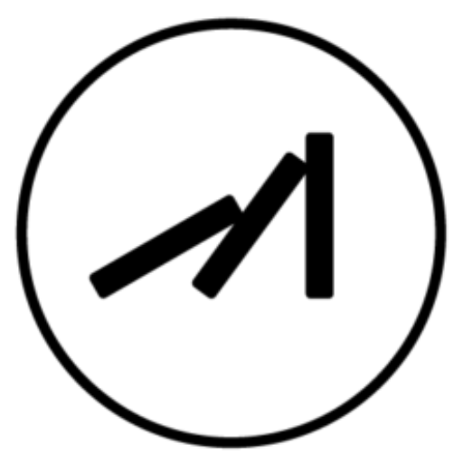

業主想要有火與太陽的元素,根據貴公司的營業項目,我們也抓了一些關鍵字,並且賦予品牌一個企業標語「照亮一家人的陽光」,更是公司的核心,像太陽一樣溫暖,更象徵每一個建案都是細心呵護,照亮客戶溫暖的太陽。
顏色部分,因有特殊需求,我們搭配了紫、銘黃與暖橘,象徵太陽的溫暖光芒,代表尊貴,更是公司對待客戶每個建案很重要的法則,同時標誌的型態以圓形為基準,中間為公司名稱縮寫字母,象徵不僅僅是客戶與工作夥伴都能達到良好的默契與向心力,是值得信賴可靠的公司。
關於標誌外圈為太陽光芒,我們以8道光芒為準則,在五行元素代表火跟土,在行星方面是太陽的象徵,8的數字意義也有永恆、力量之意,也象徵為客戶帶來好運為公司帶來富貴。
The client expressed a desire to incorporate elements of fire and the sun, aligning with the company’s business scope. Based on the provided keywords, we have developed a brand slogan: “Illuminating the warmth of families,” which represents the core values of the company. Just like the sun, it symbolizes warmth and signifies the meticulous care given to each construction project, bringing light and warmth to customers’ lives.
For the color scheme, we have chosen purple, deep yellow, and warm orange to represent the radiant warmth of the sun. These colors symbolize nobility and reflect the company’s commitment to treating each project with utmost importance. The logo is based on a circular shape, with the company’s initials at the center. It represents the harmonious collaboration and cohesion among customers and business partners, portraying the company as trustworthy and reliable.
The outer circle of the logo represents the rays of the sun. We have incorporated eight rays, which symbolize the five elements, with fire and earth being represented. In terms of celestial bodies, the sun is represented. The number eight carries meanings of eternity and strength, and it also symbolizes bringing good luck to customers and prosperity to the company.


2021
/
Designer:蔡佩珊
Line ID:@199mbywb
happentomeetdesign@gmail.com
Thank you for watching.


