
品牌簡介 ( Introduction )
以前是非常貧困,只有地瓜吃,後來學了包子後,生活開始得到改善,這一路走來很辛苦很累,但也感謝包子能改善生活,所以將包子放前面,包子是生財更多的是生活。 「王者匠心,傳統(承)美味」 王氏起家,匠心是希望之後在裡面工作的員工都能秉持匠人精神,製作包子。傳承手工饅頭製作工藝(中式傳統工法),雖使用機器塑形,但製作出手工口感,麵皮Q彈,有嚼勁的手感包子。
I used to be very poor and could only afford sweet potatoes. However, after learning how to make steamed buns, my life started to improve. It has been a tough and exhausting journey, but I am grateful that steamed buns have brought about positive changes in my life. That’s why I put the steamed bun at the forefront, as it represents not only prosperity but also a better life.
“Wang’s Craftsmanship, Traditional Deliciousness” – Wang’s family started this business, and the craftsmanship represents the hope that all employees working here will uphold the spirit of craftsmanship in making steamed buns. We inherit the traditional craftsmanship of handcrafted mantou (Chinese steamed bun), and although we use machines for shaping, we strive to achieve the texture and chewiness of handmade buns.

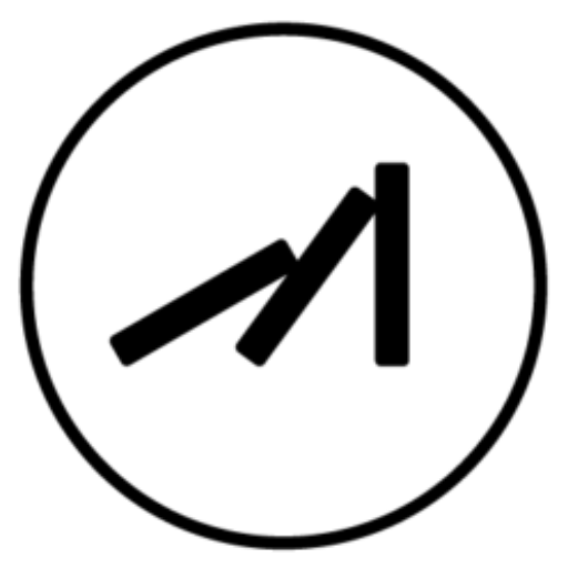
聽著業主創業的故事,明白包子對業主的重要性,也經過評估後,我們請了現代書法家書寫標準字,展現大氣的樣貌以及賦予品牌獨特的個性,標誌方面,還是以包子的形象為主,從俯視的角度做為特點,可以看出包子的折線,再結合「花蓮」的特點印象,風景好有山有海,一方面想利用「花」的型態讓人與花蓮做聯想,另一方面也象徵包子所帶來的生活,就像一座座穩固的山,環繞且保護著家園。顏色部分則想到山的顏色,讓品牌在市場上有了不一樣的呈現,整體標誌也符合業主的期望,達到日式、文青的視覺感受。
After listening to the entrepreneur’s story of starting the business, understanding the importance of steamed buns to the owner, and conducting evaluations, we enlisted the help of a modern calligrapher to write the standard characters, showcasing a grand and unique personality for the brand. As for the logo, the focus is still on the image of the steamed bun, with a characteristic top-down perspective that reveals the folds of the bun. It is combined with the impression of Hualien, which is known for its beautiful landscapes of mountains and sea. The intention is to evoke associations with Hualien through the shape of a flower, while also symbolizing the life that steamed buns bring, just like sturdy mountains that surround and protect one’s home.
In terms of colors, the idea is to use the colors of mountains to present the brand differently in the market. The overall logo meets the owner’s expectations and creates a visual experience that is both Japanese and hipster.


2021
/
Designer:蔡佩珊
Logotype:王豊淯
Line ID:@199mbywb
happentomeetdesign@gmail.com
Thank you for watching.


